Part of v2.6.0 · Chapter 4: Content & Growth
MDX BlogPolishing the AI Loading Experience
The Site Evolution page has had streaming animations since v2.5.0. Content types character-by-character, skeleton lines shrink as text appears, and a pulsing dot indicates loading. It worked. But it felt... mechanical.
Today's changes are about making it feel alive.
The Inspiration
I stumbled on a tweet by Pallav Mac showing the variety of "thinking" words Claude Code uses while processing:
Thinking... Analyzing... Pondering... Cogitating... Percolating... Noodling...
It's such a small thing, but it gives the AI personality. Instead of robotic "Loading...", you get "Marinating..." or "Vibing..." - words that feel human.
I stole this idea.
Before: Static and Predictable
The old loading flow:
- Show "Thinking..."
- Switch to "Analyzing..."
- Switch to "Loading..."
- Start streaming content
Every card did the same dance, in the same order. Predictable. Boring.
After: Random and Playful
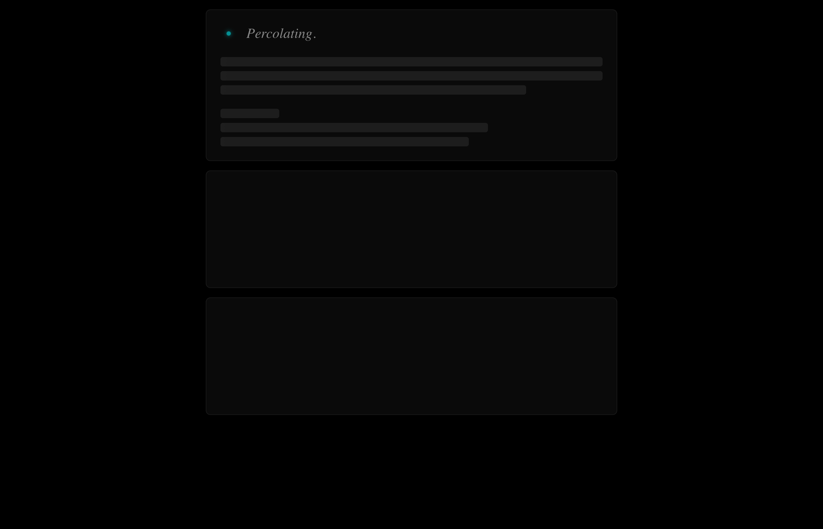
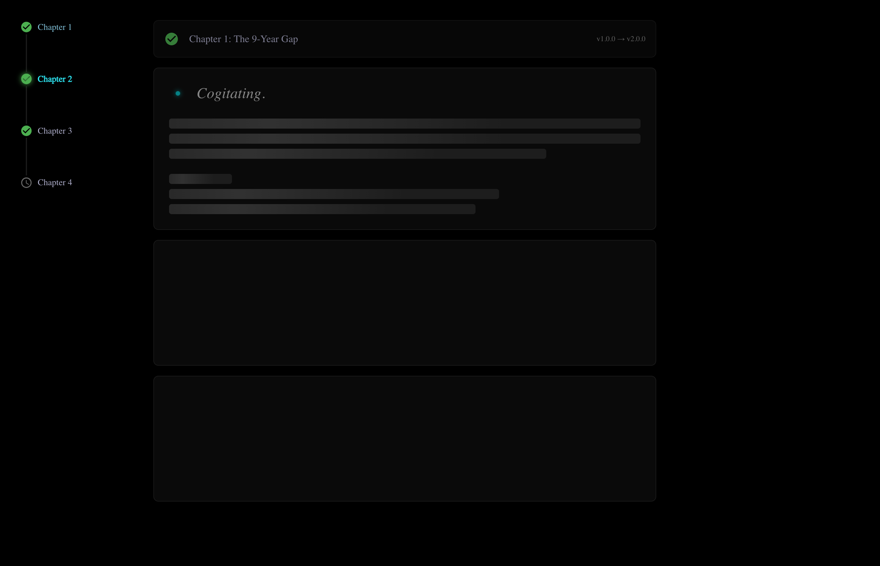
Now each card picks a random word from a pool of 15+ options:
const THINKING_WORDS = [
'Thinking...',
'Analyzing...',
'Pondering...',
'Cogitating...',
'Percolating...',
'Noodling...',
'Musing...',
'Brewing...',
'Vibing...',
'Mulling...',
'Conjuring...',
'Simmering...',
'Ruminating...',
'Marinating...',
];One card might show "Cogitating...", the next "Percolating...". The randomness feels more organic.

Animated Dots
The dots now animate: . → .. → ... → .
Instead of static "Thinking...", you see the dots cycle, suggesting ongoing thought. It's a small touch that adds life.
// Animate dots: . → .. → ... → .
useEffect(() => {
  if (phase !== 'status') return;
  if (statusCharIndex < statusWord.length) return;

  const dotInterval = setInterval(() => {
    setDotCount((prev) => (prev % 3) + 1);
  }, 400);

  return () => clearInterval(dotInterval);
}, [phase, statusCharIndex, statusWord.length]);
Snappier Timing
The old timing felt sluggish:
- 1800ms status phase
- 12ms per character
New timing:
- 600ms status phase
- 8ms per character
The result is noticeably faster without feeling rushed. Content appears quickly enough to maintain engagement.
Auto-Collapsing Chapters
The bigger UX improvement: completed chapters now collapse automatically.
The Problem
When all chapters stream fully, the page becomes a wall of text. Users who want to focus on Chapter 3 have to scroll past Chapters 1 and 2.
The Solution
After a chapter finishes streaming, if it's "completed" status, it collapses to a single-line summary. Click to expand. Click again to collapse. The header row becomes the toggle.
Manual Navigation Mode
Clicking a chapter in the sidebar nav now:
- Collapses all other chapters
- Expands the selected chapter
- Scrolls smoothly to it
This creates a focused reading experience - you see one chapter at a time, with collapsed summaries above and below.
Changelog Auto-Scroll
The Changelog tab also got love. On mount, it now auto-scrolls to the most relevant item:
- If there's an "in-progress" item, scroll to it
- Otherwise, scroll to the next "planned" item
The scroll uses a custom easing function (ease-out cubic) for that smooth, intentional feel.
Storybook Improvements
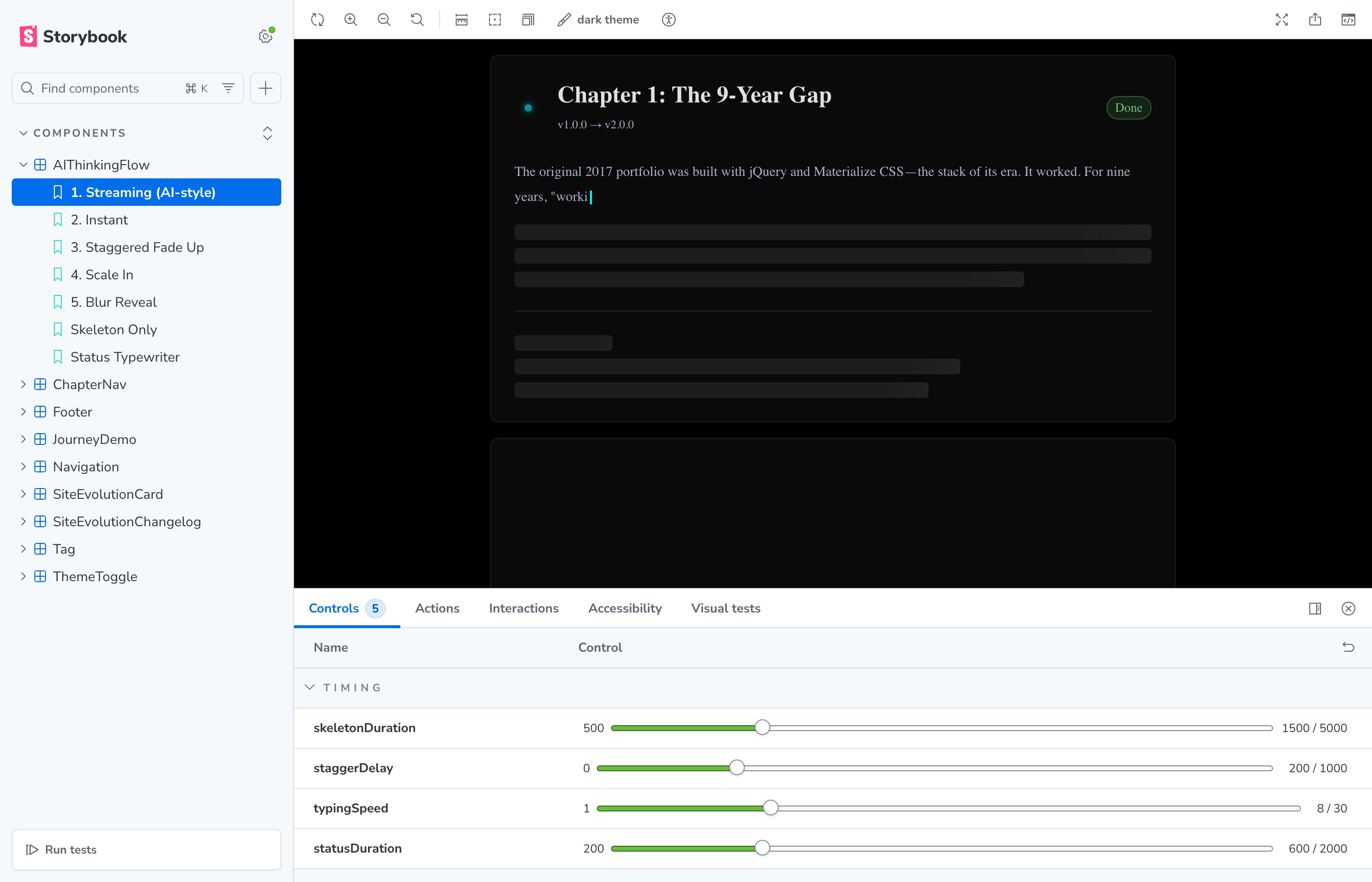
All these changes are testable in Storybook. The streaming story got better controls:
| Control | What It Does |
|---|---|
typingSpeed | Characters per millisecond (lower = faster) |
statusDuration | How long "Thinking..." shows |
staggerDelay | Gap between cards completing |
cardCount | Number of chapters to render |
The Impact
These changes don't add features. They don't fix bugs. They make the existing experience feel more polished:
| Aspect | Before | After |
|---|---|---|
| Status text | Predictable cycle | Random, playful words |
| Dots | Static | Animated (. → .. → ...) |
| Timing | 1800ms + 12ms/char | 600ms + 8ms/char |
| Completed chapters | Always expanded | Auto-collapse |
| Sidebar nav | Scroll only | Expand + scroll |
| Changelog | Static on load | Auto-scroll to active |
None of these are features users asked for. But combined, they make the page feel cared-for. That's what polish is.
Why It Matters
Portfolio sites are showcases. If the showcase has jank, what does that say about the work inside?
These tweaks take the loading experience from "works" to "delights". And that's worth an afternoon of work.