Part of v2.6.3 · Chapter 4: Content & Growth
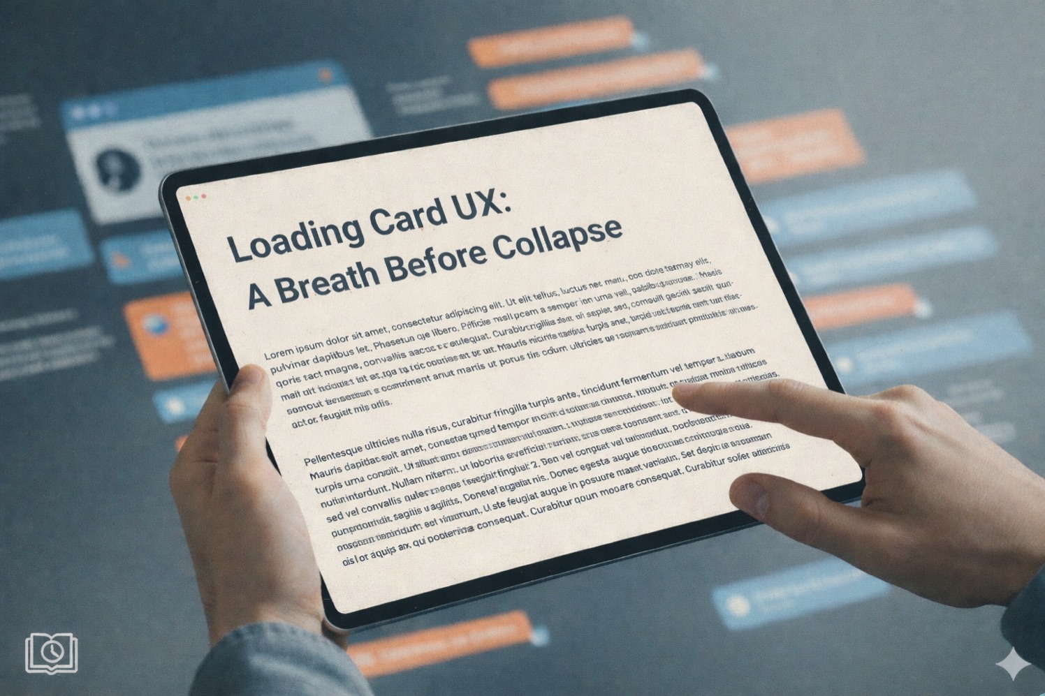
Loading Card UXLoading Card UX: A Breath Before Collapse
The Site Evolution page tells a story through expanding cards. Each chapter streams in, reveals its content, then collapses to make room for the next. It's a nice narrative flow—until you realize the collapse happens instantly.
The Problem: Stolen Attention
Watch carefully. The moment the last word appears, the card snaps shut. No warning. No transition. Just gone.
If you were mid-sentence when it collapsed? Too bad. Click to re-expand and find your place again.
This is what UX researchers call attentional theft—the interface takes control away from the user without consent. The system decided you were "done" reading before you actually were.
Why This Feels Wrong
When content disappears unexpectedly, users experience a micro-moment of disorientation. Where did it go? Did I miss something? Was that important?
These tiny friction points accumulate. Each one erodes trust in the interface. Users start to feel like the site is working against them rather than with them.
The Psychology of Dwell Time
In physical spaces, we instinctively understand dwell time. An elevator door stays open for a few seconds after you press your floor. A crosswalk signal gives you time to finish crossing. A presentation slide doesn't vanish the moment the speaker stops talking.
Digital interfaces often forget this courtesy. Content appears and disappears at machine speed, not human speed.
The fix isn't complicated: give users a breath.
The Solution: Anticipatory Pause
After streaming completes, the card now waits 3.5 seconds before collapsing. But a silent countdown would be just as jarring—you'd still be surprised when it finally collapses.
So the interface communicates its intention:
Visual Countdown
A thin progress bar at the bottom depletes over 3.5 seconds. Users can see exactly how much time remains. No surprises.
Opacity Shift
In the final moments, the card subtly fades—a gentle signal that change is coming. It's the visual equivalent of dimming house lights before a show starts.
Hover to Pause
Move your mouse over the card, and the countdown freezes. The interface says: "Take your time. I'll wait."
This combination follows a UX principle called progressive disclosure of intent. The system tells you what it's about to do, gives you time to react, and respects your override.
User Control Spectrum
The best interfaces offer multiple levels of control:
| User Intent | Action | Result |
|---|---|---|
| "I'm still reading" | Hover over card | Countdown pauses |
| "I'm done, move on" | Click the card | Collapses immediately |
| "I wasn't paying attention" | Do nothing | Auto-collapses after 3.5s |
Each user gets the experience that matches their pace. Fast readers can skip ahead. Slow readers can linger. Distracted users get a reasonable default.
The Invisible UX Win
Here's the thing about good UX: users rarely notice it. They don't think "What a thoughtful dwell period!" They just... don't get annoyed.
The absence of friction is the goal. When content collapses smoothly with adequate warning, users stay in flow. They finish reading, see the countdown, and naturally shift attention to the next card.
No interruption. No re-orientation. No frustration.
Before & After
| Aspect | Before | After |
|---|---|---|
| Collapse timing | Immediate | 3.5 second pause |
| User awareness | Surprised | Prepared |
| Control | Click to re-expand | Hover to pause |
| Visual feedback | None | Progress bar + fade |
Small details. Big difference in how the experience feels.
The Takeaway
Respecting user attention isn't about slowing things down—it's about matching interface speed to human speed. Give users time to absorb. Signal your intentions. Let them override your defaults.
A breath before collapse. That's all it takes.