Redesigning the Donation Mentoring Portfolio Page
My portfolio project pages were boring. Screenshot, tech stack, link to live site. Done.
That format tells visitors what I built but not why it matters or how I think. So I redesigned the Donation Mentoring portfolio page to tell the full story.
The Problem with My Old Portfolio Pages
Most of my project pages followed a predictable pattern:
- Project title and description
- Screenshot
- Tech stack badges
- Link to live site
This works for a quick overview, but it doesn't differentiate. Every portfolio looks like this. It doesn't show how I approach problems or make decisions.
What I Changed
BentoBox Component for Key Metrics
Instead of a bullet list of features, I created a new BentoBox component to display project metrics at a glance.
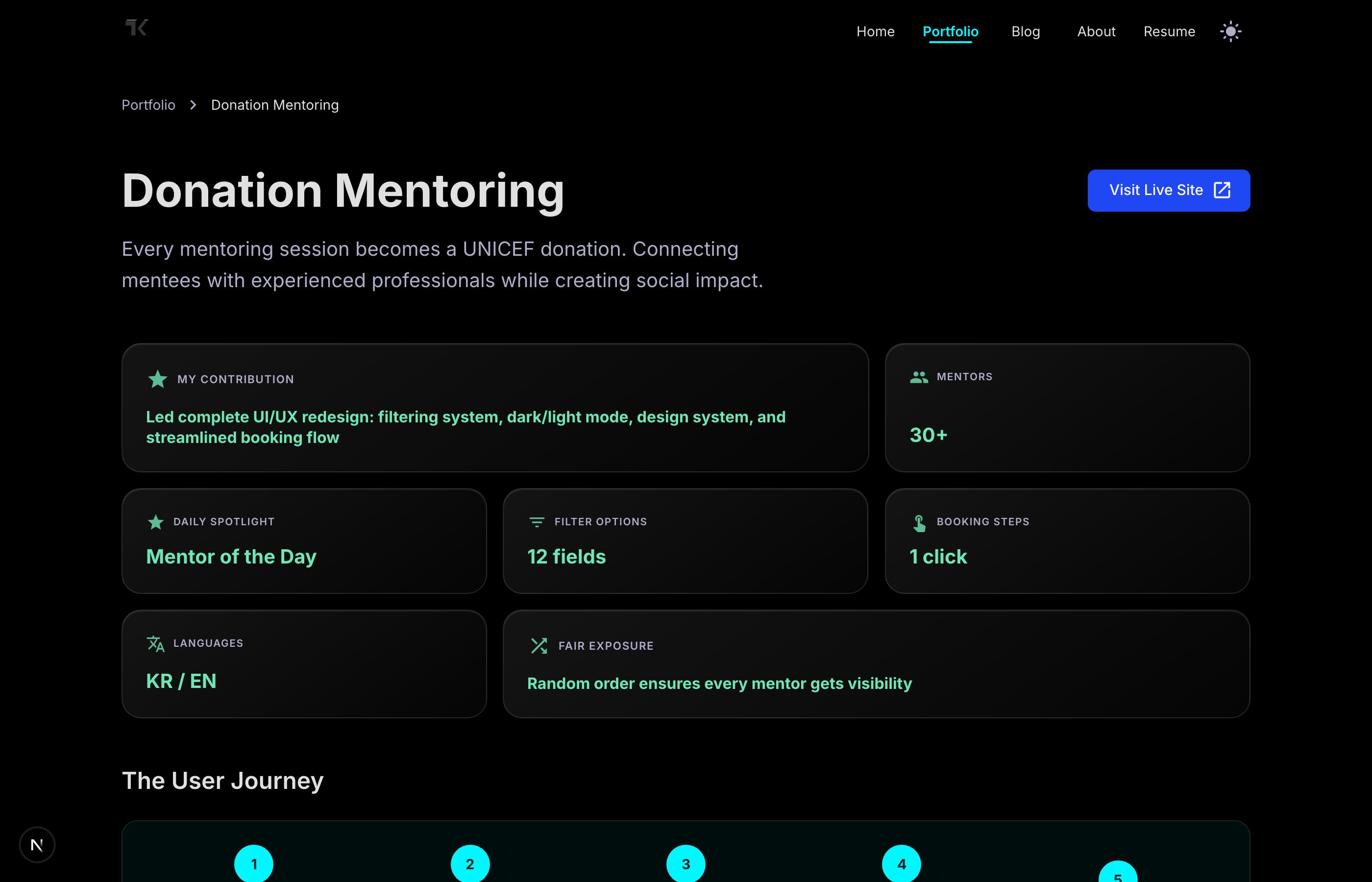
The component supports three visual variants:
| Variant | Use Case |
|---|---|
| Default | Subtle background with border emphasis |
| Glass | Frosted glass effect with backdrop blur |
| Gradient | Soft gradient background |
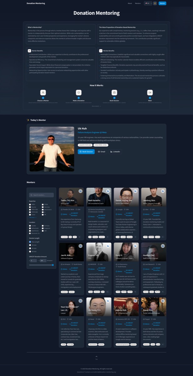
Each card can span multiple columns (colSpan) or rows (rowSpan) for flexible layouts. My contribution spans two columns to stand out, while metrics like "30+ Mentors" and "1 click booking" stay compact.
The hover state adds a subtle lift animation and glow effect, making the grid feel interactive without being distracting.
Narrative Structure for Version Cards
Each version of the project now follows a consistent structure:
| Section | Purpose |
|---|---|
| The Challenge | What problem this version solved |
| Pain Points | Real friction users experienced |
| The Solution | How we addressed it |
| Key Decisions | Technical choices and rationale |
| Impact | What changed for users |
| Learning | Takeaways for future work |
This mirrors how product teams actually think. Instead of listing features, it tells the story of why decisions were made. Recruiters and collaborators can see my problem-solving process, not just the output.
User Journey Visualization
Instead of describing the platform in paragraphs, I added a visual flow diagram showing the user journey in five steps. Visitors can understand how the platform works at a glance.
Storybook Documentation
The BentoBox component includes comprehensive Storybook stories demonstrating:
- All three variants (default, glass, gradient)
- Different color schemes (cyan, emerald, violet, coral, gold, mint)
- Various grid configurations
- The actual Donation Mentoring metrics as a real-world example
This makes it easy to reuse the component in future projects and lets others understand its capabilities through the design system.
Image Optimization
While updating the page, I also converted all site images from PNG to JPG. The file size reduction was significant:
| Image | Before (PNG) | After (JPG) | Reduction |
|---|---|---|---|
| current | 5.7 MB | 118 KB | 98% |
| v1 | 12.3 MB | 117 KB | 99% |
| v2 | 20 MB | 77 KB | 99.6% |
This wasn't just for the Donation Mentoring page—I applied this across the entire site. Faster load times, better Core Web Vitals.
Why This Matters for Portfolios
A good portfolio page should:
- Show thinking, not just output - Anyone can list features. Showing why you made decisions demonstrates judgment.
- Tell a story - Projects evolve. Showing that evolution proves you can iterate and learn.
- Be scannable - Recruiters spend seconds on each page. Visual hierarchy matters.
- Be documented - Storybook stories make components reusable and discoverable.
The old page was a feature list. The new page is a case study.
Links: