
Part of v2.8.1 · Chapter 5: Landing Page Evolution
Landing Page Core SectionsLost in the Middle
I recently shipped the new hero section for my portfolio. Centered text, staggered animations, two clear buttons. It felt good. The kind of improvement where you refresh the page a few too many times just to watch it load.
Then I scrolled down.
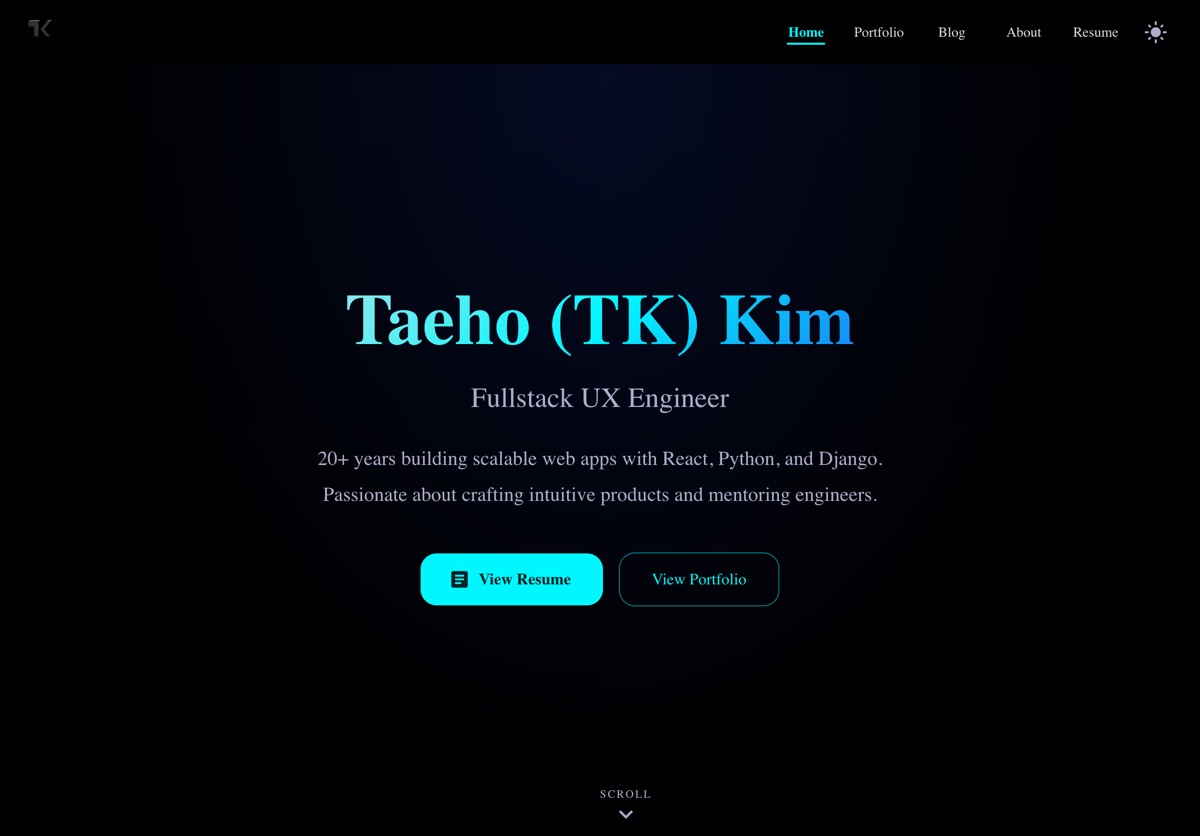
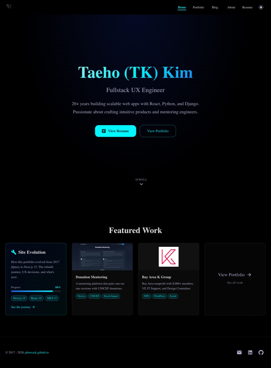
The hero does its job. You land, you see my name, you know what I do, you have two options: resume or portfolio. Clean.
But then you scroll past it, and this is what you get:
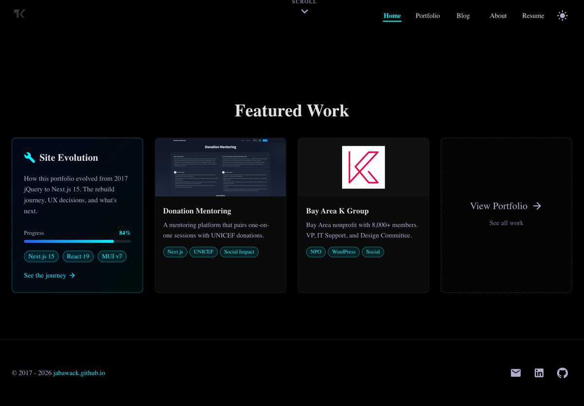
Four project cards. Site Evolution, Donation Mentoring, Bay Area K Group, and a "View Portfolio" link. All fine. All useful. But something felt rushed about the transition.
You go from "Hi, I'm TK, I'm a Fullstack UX Engineer" directly to "Here are some things I built." There's no bridge. No buildup. It's like meeting someone at a coffee shop and after they say their name, they immediately hand you their entire portfolio binder.
The gap I couldn't unsee
I kept scrolling up and down. Hero, cards, footer. Hero, cards, footer. The page told you two things: who I am and what I've built. That's it.
What it didn't tell you is what I'm actually good at. Twenty years of experience, and nowhere on this page could you get a sense of my skillset without clicking through to individual projects. A recruiter would have to piece it together from project descriptions. A hiring manager would have to guess.
And there was no personal touch at all. Nothing about how I think about building software. Nothing about what drives me. The About page has that stuff, sure. But most people never make it to the About page. They decide in seconds whether to keep going or bounce.
I realized the landing page had a beginning and an end, but no middle.
Thinking about what belongs between "hello" and "here's my work"
I went back to that sketch I'd made when planning the landing page overhaul. The original idea had five sections:
- A hook (the hero, done)
- Skills shown, not just listed
- A personal statement, something about my philosophy
- The work itself (featured projects, done)
- Social proof (testimonials, later)
I'd shipped 1 and 4 and skipped straight over 2 and 3. The sections that give context. The parts that help someone understand the work before they see it.
Think about it this way. If I tell you "I built a mentoring platform that donates to UNICEF," that's interesting. But if I first show you that I've spent 20 years across frontend, backend, and design, that I care deeply about UX and mentoring junior engineers, then that project card hits different. You see it through a lens. The skills and philosophy give the work meaning.
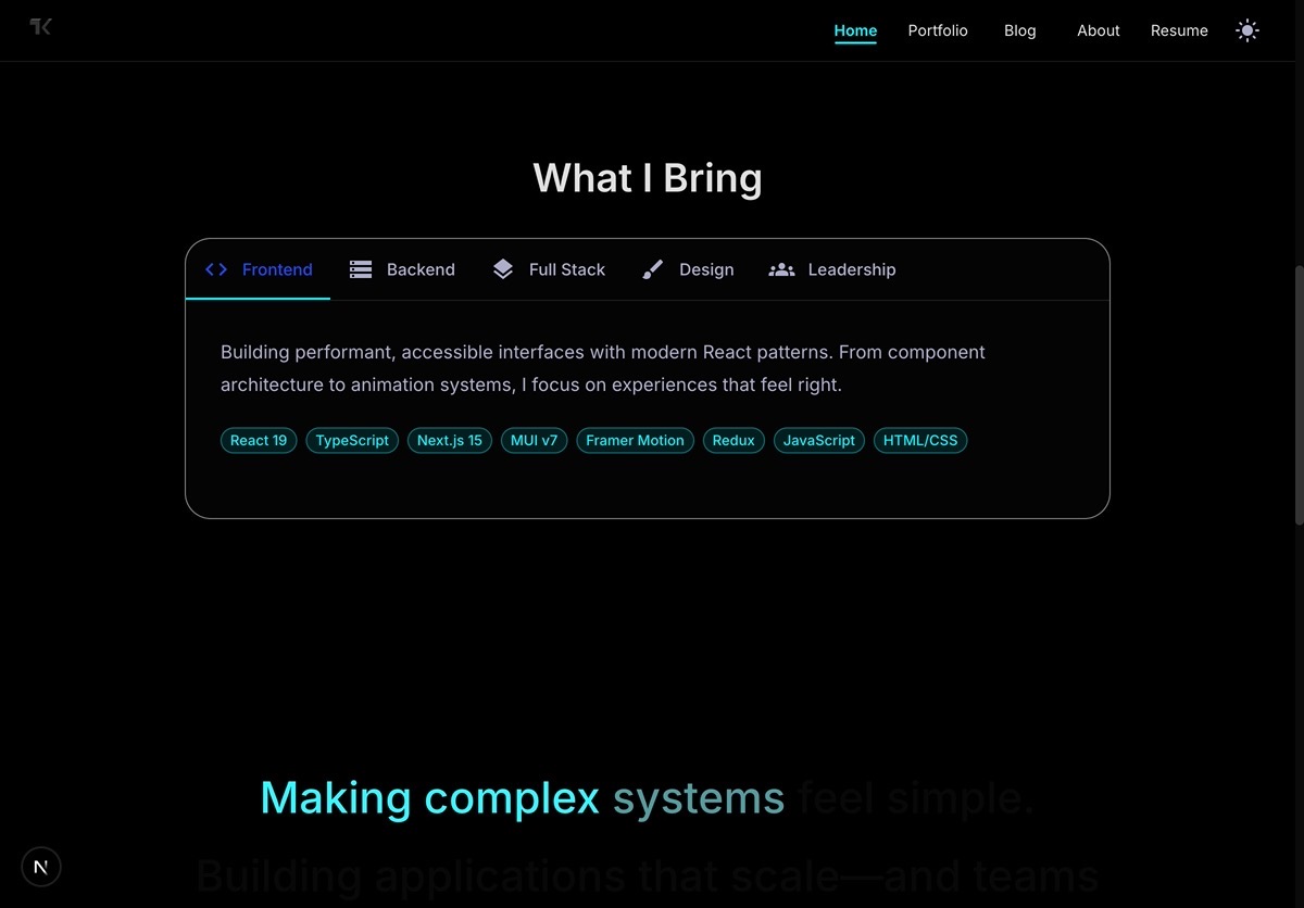
Skills: showing range without showing off
The first thing I wanted was a skills section. But not the kind with a grid of logos and self-assessed percentage bars. Those always felt hollow to me. "React: 95%." What does that even mean? Compared to what?
Instead, I wanted something that lets visitors explore at their own pace. Tabs felt right. Click "Frontend" and see the frameworks, tools, and patterns I work with. Click "Backend" and see a different world. Click "Design" or "Leadership" and the picture keeps expanding.
The key was making each tab feel substantial without being overwhelming. Not a resume dump. More like, "here's what I'd bring to the table if we worked together." Specific enough to be credible, concise enough to be scannable.
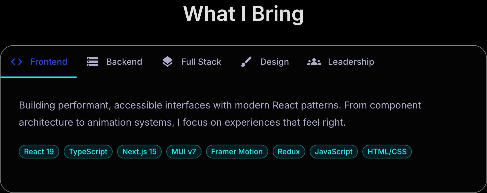
Each tab tells a slightly different story. Frontend is where I've spent the most time, so it shows depth. Backend shows breadth. The leadership tab is the one I'm most proud of, honestly, because it's the hardest to communicate on a portfolio site. How do you "show" mentoring? How do you screenshot a code review that helped someone level up?
A personal statement that earns its space
The second piece was trickier. A "personal statement" sounds like a college application essay. Nobody wants to read that on a portfolio site.
But I kept coming back to the idea that visitors should know what I care about before they see the projects. Not in an abstract, mission-statement way. More like... if you and I were having coffee, and you asked me what I've been thinking about lately, what would I say?
I landed on a scroll-triggered text reveal. As you scroll through the section, words appear in sequence. Not all at once. Not animated in some flashy way. Just... revealed. Like the page is speaking to you as you move through it.
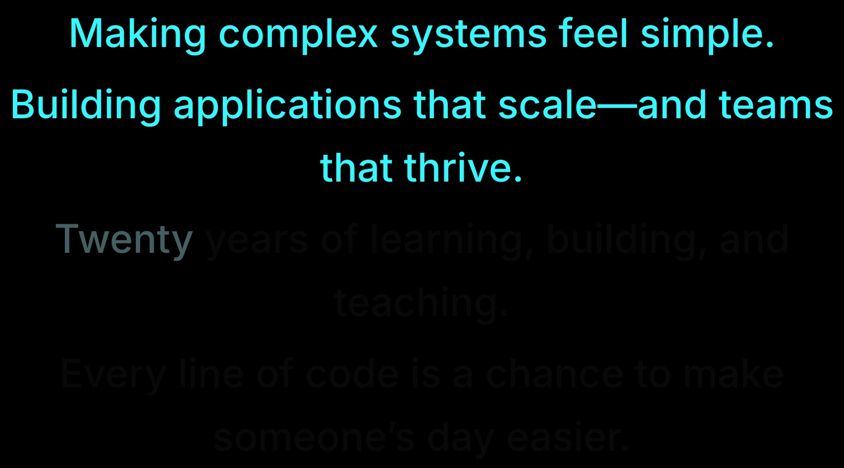
The effect is subtle. You might not even register that the text is animating. But it changes the feel of the section. Instead of reading a paragraph that's already there, you're uncovering it. It creates this small moment of engagement that a static block of text never would.
The content itself is deliberately simple. What I believe about building products. Why UX matters to me. What I've learned from mentoring. Nothing fancy. Just honest.
The page has a shape now
Here's the full landing page with the new sections in place:
Compare that to where we started:
The before version jumps from introduction to portfolio. The after version tells a story. You meet me, you learn what I can do, you hear a bit about how I think, and then you see the work. Each section builds on the previous one.
It's not about adding more content for the sake of length. It's about giving each piece of information the right context. The skills section makes the project cards more impressive. The personal statement makes the skills feel purposeful. The hero sets the tone for all of it.
What I'm noticing
The page scrolls longer now, obviously. But it doesn't feel longer. Each section has enough visual interest that you want to keep going. The tabs invite clicking. The text reveal invites scrolling. The project cards invite exploring.
I think that's the difference between a page that's long and a page that has depth. Length is just more stuff stacked vertically. Depth is when each layer adds meaning to the layers around it.
There's still more to come. The project spotlight section (v2.9.0) will give featured work more room to breathe. Testimonials (v2.10.0) will add the social proof layer. But even now, the page feels like a complete thought instead of a half-finished sentence.
Sometimes the most important work isn't adding new features. It's filling in the parts you skipped on the first pass.
This is part of an ongoing series about building my portfolio in public. Follow along on the Site Evolution page.