
Part of v2.8.0 · Chapter 5: Landing Page Evolution
Landing Page FoundationCrafting a First Impression That Sticks
A few weeks ago, I sent my portfolio link to a colleague. We'd worked together years back, and he was curious what I'd been up to. A couple days later he mentioned he'd "checked it out." That was it. No follow-up questions, no comments about specific projects. Just... checked it out.
That bothered me more than it probably should have.
I pulled up the site myself and tried to see it fresh. Really look at it like a stranger would. Here's what I saw:
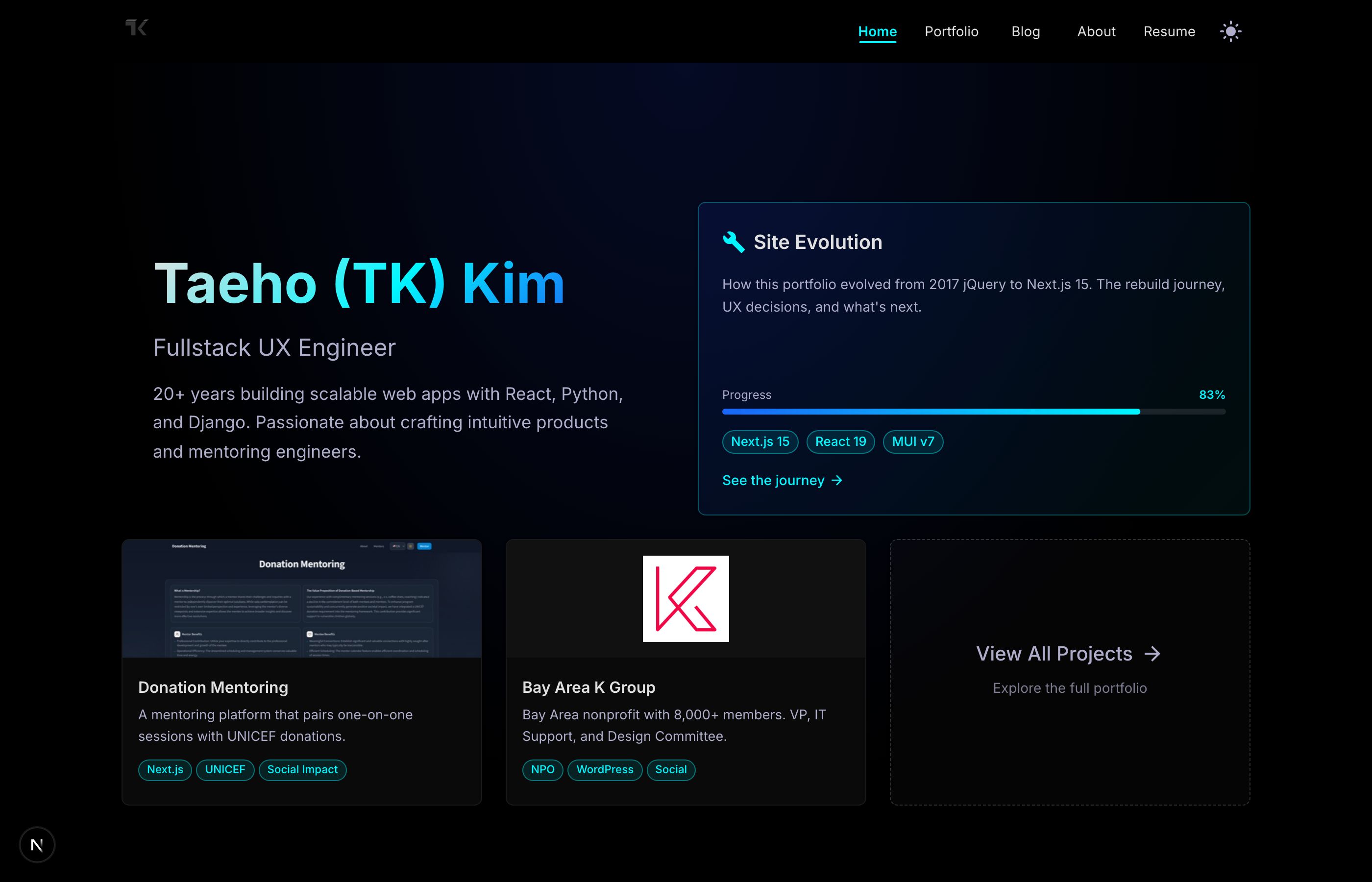
It's fine. Clean layout, professional enough. My name's there, my title, a few project cards. The Site Evolution widget shows I'm actively building. Everything you'd expect from a portfolio.
But here's the thing. There's nothing to do. No scroll. No journey. You land, you see everything, you leave. The whole homepage fits on one screen.
Twenty years of experience. One screenful of content. Something felt off about that ratio.
What was actually wrong
I spent a few days just... noticing things. How I interacted with other portfolios. Which ones I remembered. Which ones I immediately forgot.
The forgettable ones had something in common. They showed you everything at once. Name, work, contact. Here it all is, have a nice day. Like being handed a business card at a networking event by someone who immediately walks away.
The ones I remembered? They made me curious. They revealed things gradually. They had some sense of, I don't know, pacing.
Looking back at my own site, I saw three problems:
No obvious next step. If someone lands on this page, what should they do? There were links, sure, but nothing that said "hey, start here." The thing I actually want people to do (look at my resume) wasn't even prominent.
Everything revealed at once. No reason to scroll, no sense of discovery. You see the whole hand immediately.
Just facts, no personality. "Fullstack UX Engineer" tells you my job title. It doesn't tell you anything about how I think or what I care about.
What I wanted instead
I kept thinking about good conversations. You know when you meet someone at a party and within a minute you know you want to keep talking to them? They don't recite their LinkedIn summary at you. They say something interesting. They make you want to ask a follow-up question.
That's what I wanted the landing page to do. Make people want to scroll down. Make them curious about what's next.
I sketched out a rough plan:
- A hook. Clear intro, obvious action to take.
- Some depth. Skills shown, not just listed.
- A bit of philosophy. What do I actually believe about building software?
- The work itself. Projects that show I can do what I claim.
- Social proof. What do people who've worked with me actually say?
Each section would only appear as you scrolled to it. Not in an annoying "everything animates" way. Just... paced. Like a conversation that unfolds naturally.
Building it (the first piece)
I started with just the hero section. The part you see first.
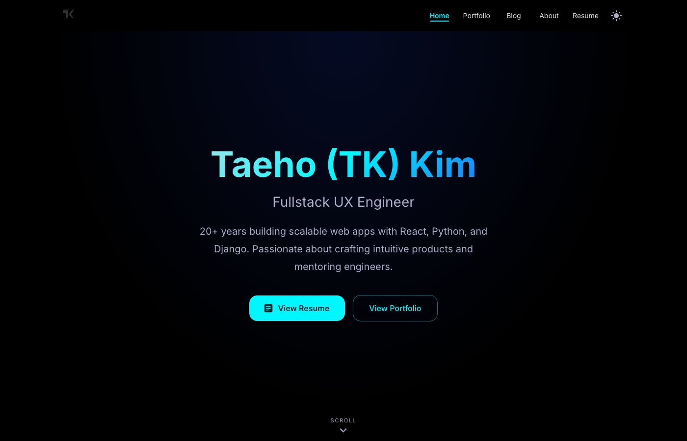
Simple changes, really. Centered the text instead of cramming it to one side. Added two buttons that answer "what should I do?" View Resume for recruiters. View Portfolio for everyone else. Put a little "Scroll" hint at the bottom for people who might not realize there's more.
The animation is subtle. When the page loads, the text fades in, moving slightly upward. Name first, then title, then description, then buttons. Takes maybe half a second total. You probably don't consciously notice it. But it creates a rhythm. Your eye follows the sequence naturally instead of darting around trying to find the important bits.
The navigation bar shrinks a little when you scroll past the hero. Gets a frosted glass effect. Still there if you need it, but it stops competing for attention.
None of this is groundbreaking stuff. But it feels different. There's a sense that someone thought about the experience, not just the information.
What I actually learned
This is the part I keep thinking about.
My old homepage tried to be efficient. Here's everything, no scrolling required, boom, done. I thought that was respecting people's time.
But I think I had it backwards.
When everything's visible at once, nothing stands out. You don't know where to look. You don't know what's important. It's actually harder to process, not easier.
The new approach is deliberately less efficient. You have to scroll to see everything. But because each piece gets its moment, you actually absorb it.
There's probably a lesson here that goes beyond portfolios. In documentation, in presentations, in pull request descriptions. We tend to front-load information, thinking more is better. But attention is limited. Sometimes the generous thing is giving people a clear starting point and letting them explore from there.
What's next
This is just the foundation. I've got more sections planned:
- v2.8.1: Skills showcase (tabs showing different areas), personal statement (some kind of scroll-triggered text thing)
- v2.9.0: Proper project spotlight with a carousel, maybe some parallax stuff for the portfolio gallery
- v2.10.0: Testimonials section, performance pass, accessibility audit
I'll update this post as each piece comes together. Or maybe write new posts. We'll see.
The goal isn't to have the fanciest portfolio on the internet. It's just to make something that doesn't disappear from memory five minutes after someone looks at it.
Based on that one data point from my colleague, I had nowhere to go but up.
This is part of an ongoing series about building my portfolio in public. The messy parts, the decisions, the things that don't work. If you want to follow along, the Site Evolution page tracks everything.