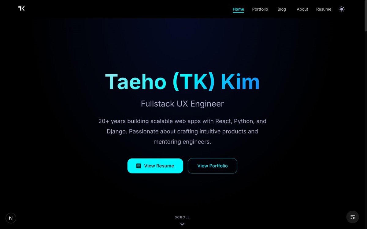
Don't Make Them Earn It
Imagine walking into a gallery. You see the artist's name on the wall, a brief bio. Nice. Then you enter a hallway of plaques: their training, their philosophy, their influences, their process. You're reading, you're nodding, you're getting the picture. And then, finally, at the very end of the hallway, the paintings.
Most people would've left somewhere around the third plaque.
That's what my landing page was doing. After the hero redesign and filling in the middle, the page had a solid flow: introduction, skills showcase, personal statement, and then... the work. Featured projects sat at the very bottom, just above the footer. The thing visitors actually came to see was the last thing they'd reach.
The scroll that felt backwards
I kept watching how I navigated other people's sites. When I landed on a portfolio, what did I want? The work. Almost immediately. The bio and philosophy were interesting, sure, but only after something caught my eye first.
My page was asking visitors to invest before showing them the payoff. "Read about my skills. Read about my philosophy. Now, if you're still here, look at what I've built." That's backwards. It's like a restaurant that makes you read the chef's memoir before handing you the menu.
The skills section and personal statement earned their place (that was the whole point of the previous post). But they were in the wrong position. Context should support the work, not gate it.
Paintings first, plaques second
The fix was simple: move Featured Work up, right below the hero.
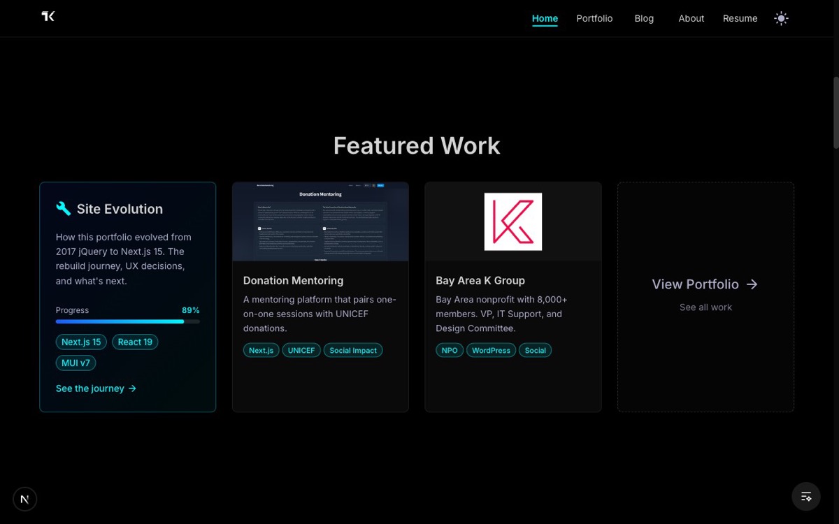
You land, you see my name. You scroll once, you see my work. Site Evolution, Donation Mentoring, Bay Area K Group, and a path to the full portfolio. No earning required. The skills showcase and personal statement still exist, but they come after. They add depth to something you've already seen, rather than delaying it.
It's a small reorder, but it changes the entire feel. The page now leads with proof instead of promises.
The page that didn't know how to end
With the work moved up, something else became obvious. The bottom of the page was empty. You'd scroll past the personal statement and just... arrive at the footer. No transition, no closing thought. The conversation trailed off mid-sentence.
Two things were missing. First, there was no sign that this site was alive. Projects are great, but they're static. A visitor couldn't tell whether I built these last week or three years ago. Second, there was nowhere to go. If someone scrolled all the way down and thought "I'd like to talk to this person," the only option was hunting through the nav bar.
Proof of life
The first addition was a Latest Posts section. Three recent blog posts, pulled automatically from the blog feed, with thumbnails and dates.
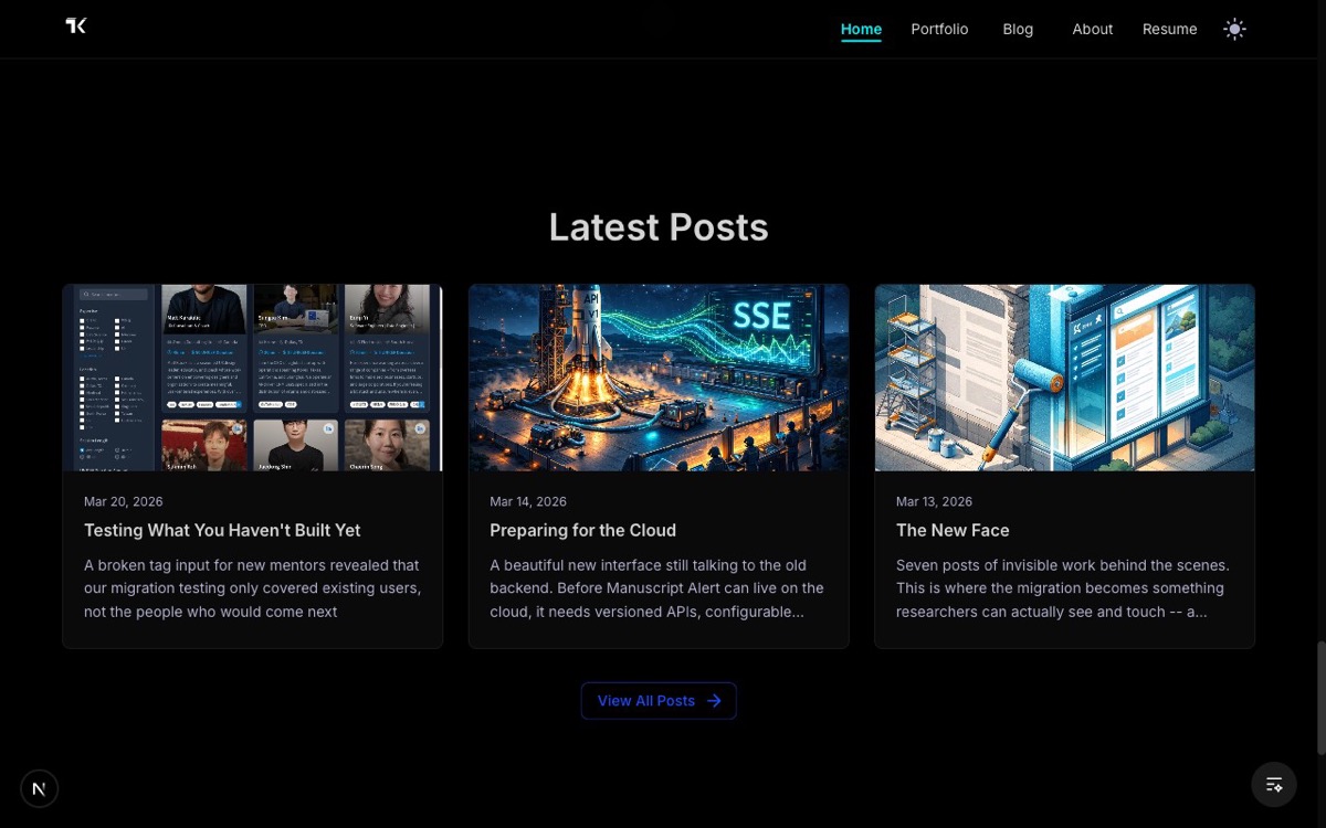
This does something the project cards can't: it shows momentum. A visitor sees posts from the past couple of weeks and knows this isn't a portfolio that was set up once and forgotten. Someone's actively building, writing, thinking out loud. That matters. Especially for a site that's literally built around the idea of working in public.
The posts update themselves. No manual curation. Whatever I've written most recently shows up on the landing page. It's a window into what I'm working on right now, not a curated highlight reel.
A door, not a wall
The second addition was a contact section. Email, LinkedIn, GitHub. Three buttons, one sentence of context.
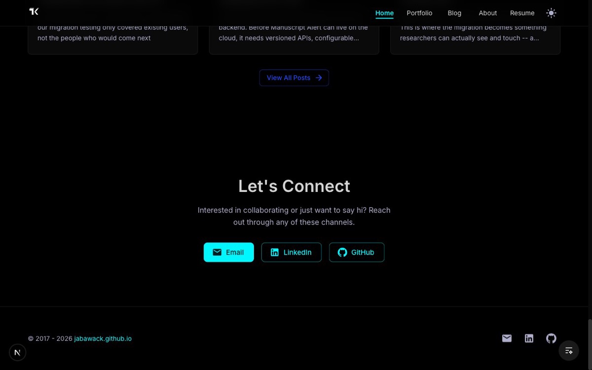
It's deliberately simple. No contact form with eight fields. No "tell me about your project" intake process. Just: here's how to reach me. The goal isn't to qualify leads. It's to make it easy for someone who just scrolled through my entire landing page to take the next step, whatever that looks like for them.
The page has an ending now. Not a dead stop at the footer, but an invitation. You've seen the work, you've read the writing, you know how I think. Want to talk? Here's how.
The full picture
The landing page tells a complete story now. Six sections, each one doing a specific job:
- Hero catches your attention
- Featured Work shows what I've built
- Skills shows what I bring to a team
- Personal Statement shows how I think
- Latest Posts shows I'm actively building
- Contact gives you a next step
Before, it was a pitch that forgot the ask. Now it's a conversation with a natural arc. You arrive, you explore, you decide, you act.
Consistency across the portfolio
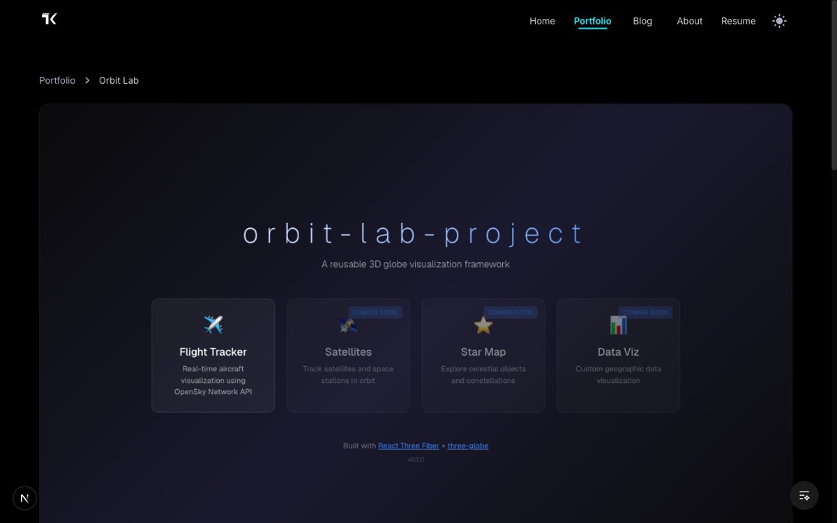
While I was rethinking the landing page flow, I noticed something about the individual project pages. Ask Prism, Manuscript Alert, and Orbit Lab all had the same structure: breadcrumb navigation, title, description, action buttons, and a metrics grid. But each one was built independently, with slightly different spacing, slightly different patterns, slightly different quirks.
I pulled all of that into a shared layout. Same structure, same rhythm, every time. Now when a visitor clicks from one project to another, the experience feels cohesive. The content changes, but the shape stays familiar. It's the kind of thing you don't consciously notice when it's right, but you feel when it's wrong.
What changed
None of this is flashy. Moving sections around, adding a blog feed, putting in a contact bar, unifying page layouts. It's the kind of work that doesn't make for impressive demos.
But I keep thinking about that gallery analogy. The paintings were always good. They were just in the wrong room. Now they're the first thing you see when you walk in. And when you're done looking, there's a guest book by the door.
This is part of an ongoing series about building my portfolio in public. Follow along on the Site Evolution page.