The New Face
Seven posts of organizing, splitting, testing, and automating. Important work, all of it. But if you'd asked DK whether anything changed, he'd have shrugged. The app looked the same. His daily routine of searching for Alzheimer's and neuroimaging papers felt the same. Every improvement lived behind the walls.
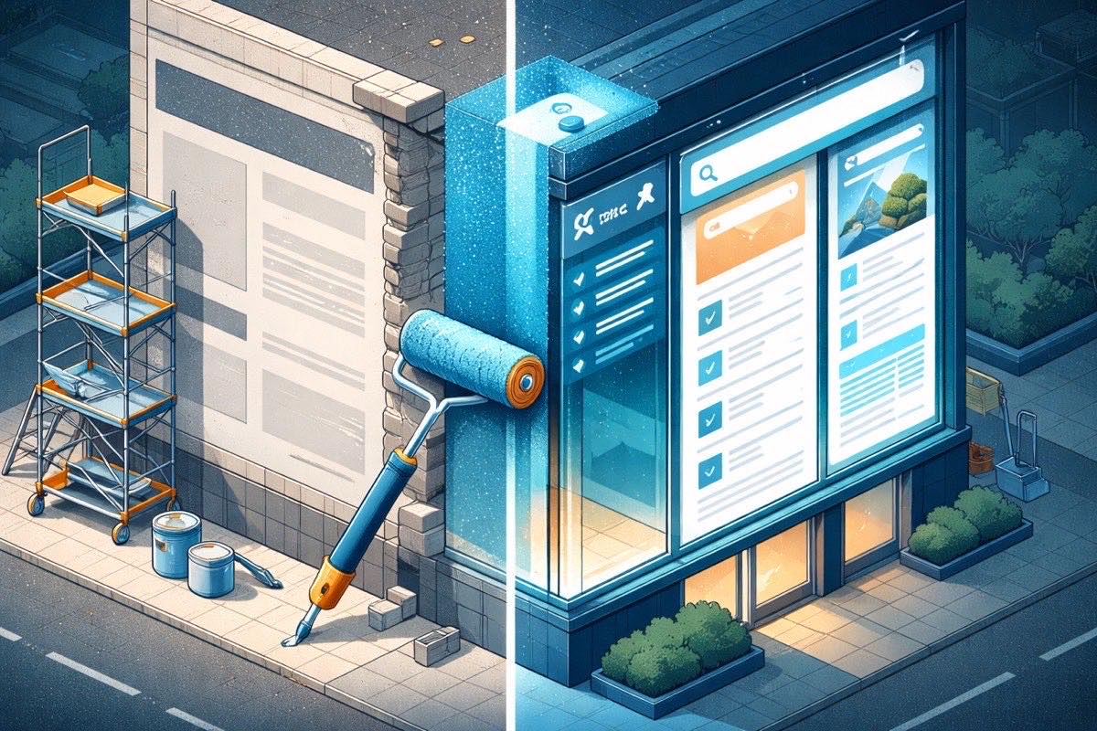
Imagine renovating a restaurant. You've rewired the kitchen, reorganized the walk-in, installed a fire suppression system, and upgraded every appliance. The food is safer and the staff can move faster. But a customer walking through the front door sees the same dining room they've always seen: the same cramped tables, the same paper menus, the same single counter where you order, pick up, and pay all in one spot.
This post is about finally renovating the dining room.
The Room That Tried to Be Everything
The old interface put everything on one page. Three tabs across the top — Papers, Models, Settings — each marked with an emoji icon. Click a tab, and the content underneath swapped. Click away, and it hid behind a curtain until you came back.
It worked the way a studio apartment works. Cooking, sleeping, and working all happen in the same room. You get used to it. But the moment you want to cook dinner while someone else is working at the desk, you realize why rooms have walls.
For DK, this meant his paper results lived on one tab. His search configurations lived on another. Statistics about what he'd found were wedged into whatever space was left. Everything was visible or nothing was — no way to see your search controls and your results and your statistics at the same time. Every action required a tab switch, and every tab switch meant losing sight of something else.
The bigger problem was what the interface couldn't express. There was no room for new ideas. Where would real-time agent updates go? How would you show a paper's full details without leaving the list? Where would a knowledge base live? The old layout had three tabs. Adding a fourth would make the navigation cramped. Adding a fifth would break it.
Three Zones, One View
The new design starts from how researchers actually work. When DK searches for papers, he needs three things visible at once: his search controls, the results, and a summary of what he's found. Not on three tabs. On one screen, side by side.
The left panel holds the search controls. Data sources (arXiv, bioRxiv, medRxiv, PubMed), search depth, journal quality filters, and active keywords — everything that shapes a search, in one persistent sidebar. DK can adjust a source toggle and see his results update without losing his place. No tab switching. No context lost.
The center is the paper feed. This is where DK spends most of his time: scanning titles, checking scores, reading abstracts. Each paper shows its relevance score with a color-coded indicator — green for strong matches, amber for moderate, red for weak. The source is marked with a colored badge so you can tell at a glance whether a paper came from PubMed or arXiv. When results are loading, placeholder cards pulse gently instead of showing a blank screen. When something goes wrong, the error appears right where the papers would be, not in a popup that blocks everything else.
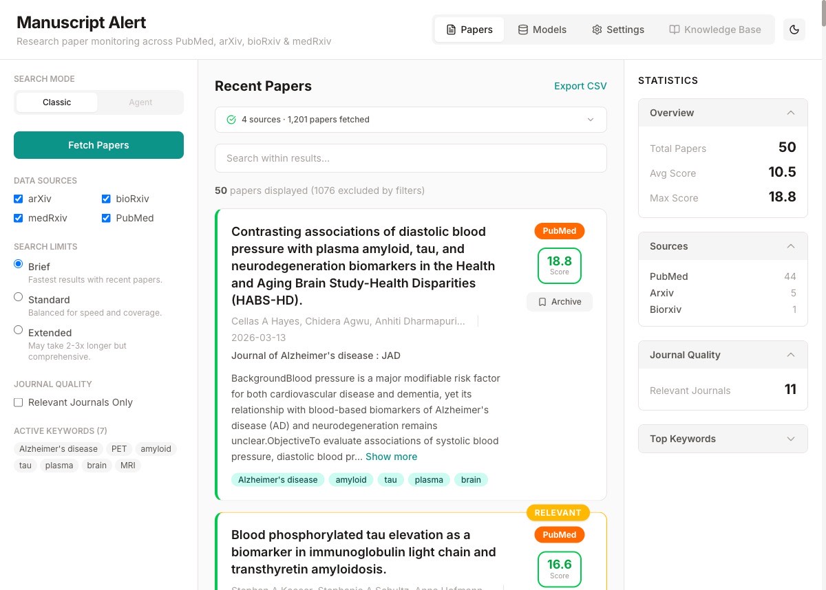
The right panel is the dashboard. Paper counts, source breakdowns, journal quality distribution — the summary statistics that help DK understand what a search returned without scrolling through every result. Before, these numbers were buried inside the results tab. Now they sit beside the results, updating as DK filters and searches.
Rooms Instead of Curtains
The old interface kept everything on one page and used curtains (CSS display toggles) to show and hide content. The new one gives each major feature its own address. Papers live at the front door. Models have their own page. Settings have their own page. A knowledge base section is already in the navigation, grayed out with "Coming soon," waiting for the work we haven't done yet.
This matters more than it sounds. When DK bookmarks his settings page, the bookmark actually works. When he shares a link to the app, it opens where he expects. And when we build new features, each one gets its own space without crowding what's already there.
The navigation moved from emoji tabs to a proper bar with icons from a consistent design library. Small detail, but it changes how the app feels. Emojis are playful. Icons are professional. For a tool that helps researchers track the latest papers in their field, professional is the right tone.
The Details You Don't Notice Until They're Missing
A loading screen used to be a spinning circle in the middle of a blank page. Now it's skeleton cards that mirror the shape of real paper results — gray blocks where the title, authors, and abstract will appear. The screen feels alive while waiting, instead of empty.
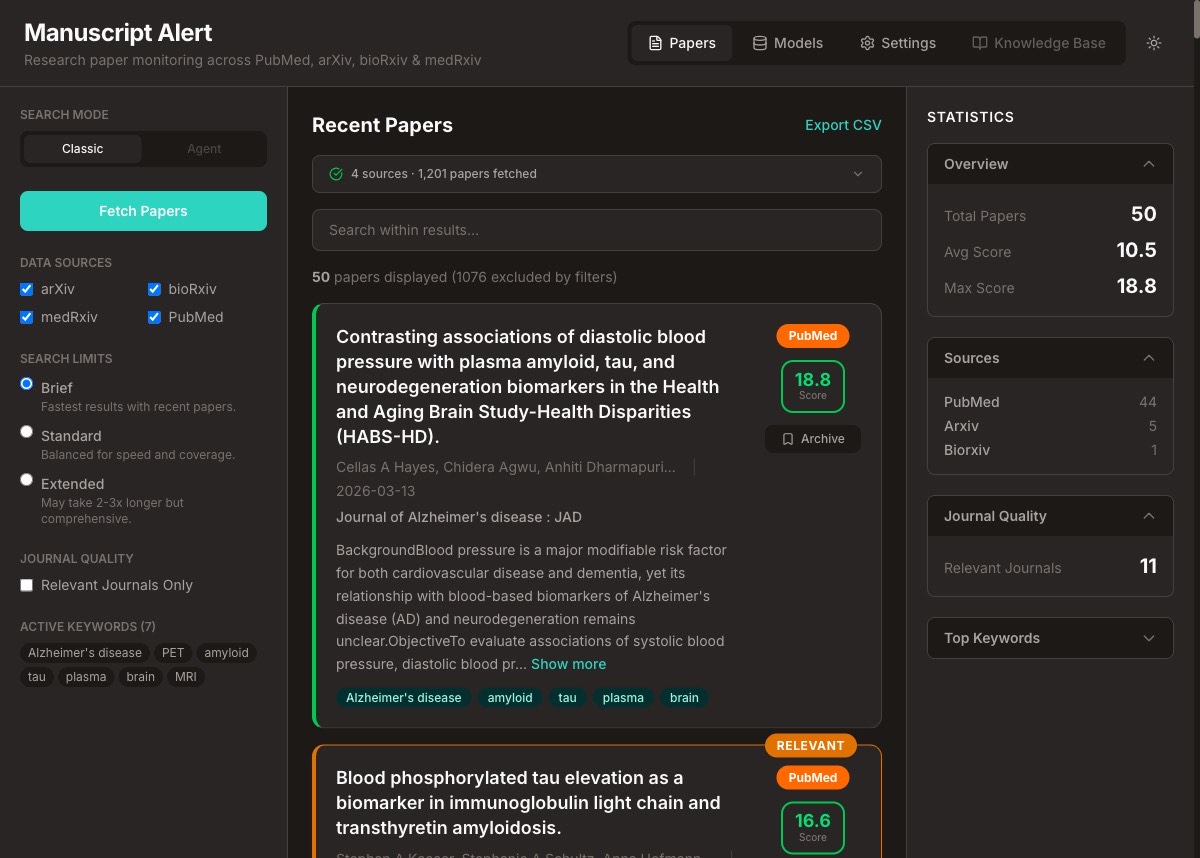
Dark mode arrived. Not because it's trendy, but because DK sometimes checks papers in the evening. A white screen at 10 PM is an assault. A dark interface is a courtesy.
Error messages went from generic alerts to contextual notices that appear exactly where the problem is. If a source fails, the warning shows up in the paper feed with the specific source name. If no keywords are configured, the empty state tells you to visit Settings instead of just saying "No results."
None of these are features a researcher would ask for. But they're the difference between a tool that feels like it was built by someone who uses it and one that feels like a homework assignment.
The Same Tool, Made Visible
DK ran through his full workflow after the redesign. Searched for Alzheimer's and neuroimaging papers across all four sources. Toggled PubMed off and back on. Switched between Brief and Standard search depths. Checked the statistics panel to see how results distributed across sources. Exported results to CSV. Opened Settings to adjust keyword weights. Loaded a saved model preset. Everything worked.
But this time, "everything worked" meant something different. Before, it meant the output was correct. Now it meant the experience was right. Search controls stayed visible while results loaded. Statistics updated without a tab switch. Scores were immediately readable. The information DK needed was where he expected it, when he expected it.
42 files changed across this commit. About 1,500 lines added, 1,100 removed. The net addition was small because so much of the old code was replaced, not piled on. Old components that tried to do everything were replaced by focused ones that each do one thing well — echoing the same principle we applied to the backend four posts ago.
Why This Matters
The previous seven posts built a foundation that researchers couldn't see. This post built an experience they can't miss. It's the same tool underneath: the same keyword matching, the same scoring algorithms, the same source integrations. But the way a researcher interacts with it changed completely.
More importantly, the interface now has room to grow. The agent activity stream has a placeholder ready. The knowledge base has a nav slot waiting. The three-column layout can accommodate new panels without rearranging what's already there. We didn't just redesign what exists — we made space for what's coming.
What's Next
The new face is wired to the old backend. It works, but it's talking to the same API endpoints from eight posts ago. Next, we'll rebuild the backend with versioned APIs, proper configuration management, and real-time streaming — so the interface can do things the old backend was never designed to support.