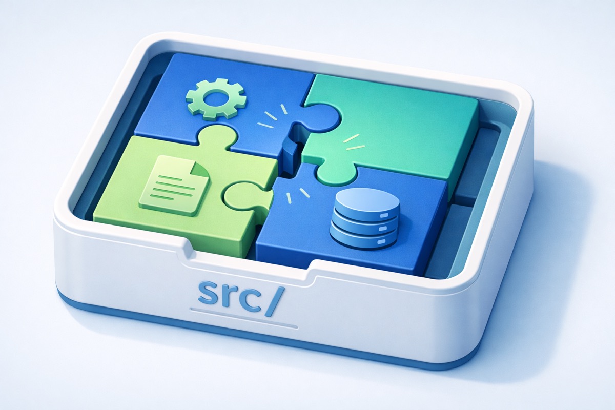
Finding the Right Shape
In the last post, I broke the 679-line monolith into focused pieces. Each part of the app got its own space. The paper search, the settings, the backups. All separate, all manageable.
But I'd made a mess in the process. Picture a move where you've unpacked all your boxes into the right rooms, kitchen stuff in the kitchen, books in the study, but half the furniture is still sitting in the hallway. You can find things if you know where to look. But someone walking in for the first time would have no idea where anything belongs.
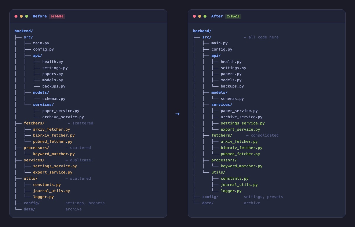
That's where the project was. The new pieces I'd just created lived in one part of the building. The original pieces that had been around since the beginning (the parts that talk to research databases, the scoring engine, the helper tools) were sitting one floor up, outside the main living space. There was even a room with the same name on both floors. Two "services" areas, doing different things, in different places.
If DK asked me where the code lived that fetches papers from PubMed, I'd have to say "well, it depends which level you're looking at." That's not a structure anyone can navigate with confidence.
Everything Gets One Address
Think about a well-organized workshop. The tools go in the tool area. The raw materials go in storage. The finished work goes in its own place. You don't scatter wrenches across three different rooms just because you used them on different projects.
I applied the same idea here. All the working parts of the application, everything that makes Manuscript Alert actually do its job, moved into one area. The search engine, the database connectors, the scoring logic, the keyword matching. All of it, together, in the same place.
What stayed outside? Only things that aren't part of the machinery. DK's research settings and saved search configurations live in their own space. The archive of papers he's saved over time lives in another. These are the things DK creates through using the app, not the things that make the app run.
Working parts in one place. User settings in another. Stored data in a third. Three categories, three areas, zero confusion.
Rewiring Without Rebuilding
Moving things around meant the internal wiring had to follow. When one part of the app needs to call another part, it needs to know the current address. Change the address and forget to update the wiring, the whole thing stops working the moment you turn it on.
Nine connections needed updating across five files. Every single one followed the same pattern, which made it straightforward. No creative problem-solving required. Just careful, methodical work, like relabeling mailboxes after everyone moves to a new floor.
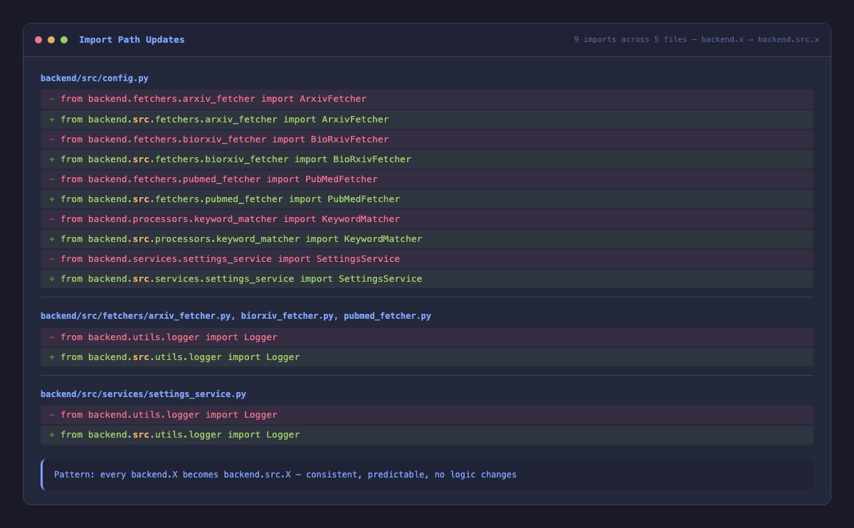
The important thing: nothing about how the app actually works changed. Not the paper search. Not the keyword matching. Not the scoring. The machinery is identical. It just has a proper home now.
Updating the Floor Plan
Here's something I've learned through this migration. If you reorganize the building but leave the old floor plan on the wall, the next person who walks in is going to end up in the wrong room.
The project's documentation still described the old layout. So I went through and rewrote it to match reality. Where things actually live now, how the project is actually structured, what each area is actually for.
Nobody celebrates updated documentation. But six months from now, when we're deep into cloud deployment or building the AI features, someone (probably me) will pull up that documentation and it'll tell the truth. That's worth the twenty minutes it took to get right.
Same Papers, Same Workflow
DK ran through his daily routine after the change. Pulled up the latest Alzheimer's and neuroimaging papers from all four databases. Loaded his saved search configuration. Tweaked a few keyword weights to catch a new research area he'd been following. Archived a couple of papers for later reading. Exported his results.
Everything worked exactly the same. He didn't notice a thing, which is exactly right. The best structural work is invisible to the person using the tool. DK cares about finding relevant papers for his research. That didn't change. What changed is how much easier it'll be for us to improve the app from here.
A Project That Explains Itself
Three posts ago, we had a monolith. Two posts ago, we gave each piece its own space. Now those pieces have a real home. Open the project and it tells you everything at a glance: here's the code, here's the configuration, here's the data. No guessing, no checking two places for the same thing.
This is the shape we needed before we could take the next step with confidence. When automated tests arrive (soon), they'll know exactly where to look. When new features get built, there's one obvious place to put them. When someone sees the project for the first time, they can find their way around without a tour.
The backend found its shape. Time to turn our attention forward.
What's Next
The backend is solid and organized. But the frontend, the part researchers actually see and touch, is running on tools that are a generation behind. Before we build a new experience on top of it, we need a modern foundation. Next up: upgrading the entire frontend toolkit so we're building on today's technology, not yesterday's.