
Upgrading the Toolkit
In the last post, the backend found its shape. Clean structure, proper documentation, every piece in its place. The Python side of Manuscript Alert was ready for whatever came next.
But "whatever came next" meant building a completely new experience for DK. A modern interface that could handle real-time updates, mobile-friendly layouts, and interactive features that Streamlit never could. And the tools we had for building that interface? They were already a generation behind.
Picture inheriting a well-organized woodshop. Every tool is labeled, every drawer is sorted. But the power drill is from the 1990s, the saw blade needs replacing, and the workbench wobbles if you push too hard. You could start your next project right now. But everything you build would carry the limitations of those old tools. Better to upgrade first, while the shop is empty and nothing depends on the old equipment yet.
Three Generations in One Move
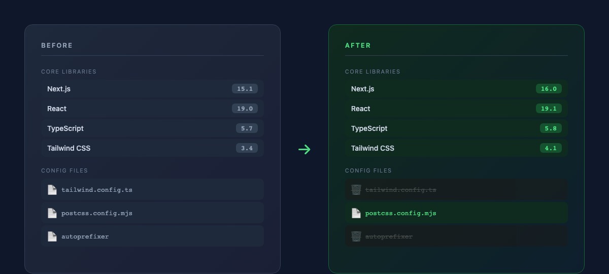
The frontend was running Next.js 15, React 19.0, and Tailwind CSS 3. None of these were broken. All of them worked fine for the existing interface. But we weren't keeping the existing interface. We were about to tear it down and build something researchers would actually want to use every day.
Next.js 16 brought a fundamentally faster build system. Pages that took seconds to compile during development now appeared almost instantly. For DK, this wouldn't matter directly. He uses the finished product, not the development server. But for me, faster builds meant faster iteration. Every idea I tried would give me feedback in a fraction of the time. Over weeks of frontend development, those saved seconds compound into hours.
React 19.1 was more subtle. Under the hood, it improved how the browser handles interactive elements. When DK clicks a button to filter papers or expand a search result, the response feels snappier. Not because the old version was slow, but because the new version is more efficient about when and how it updates what's on screen.
Tailwind CSS 4 was the biggest shift. Not just a version bump, but a rethinking of how the entire design system works.
Less Scaffolding, More Building
Here's what surprised me about this upgrade: the project got simpler. Not more complex. Simpler.
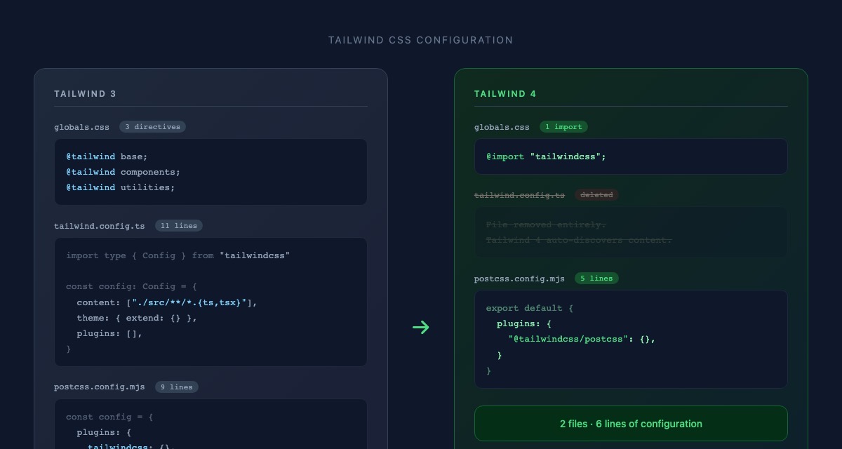
Tailwind CSS 3 needed a configuration file that told it where to find your code, how to process your styles, and what plugins to load. It also needed a separate tool called autoprefixer that ensured styles worked across different browsers. Two pieces of infrastructure just to get started.
Tailwind CSS 4 threw both of those away. The configuration file? Deleted entirely. Tailwind now figures out where your code lives on its own. Autoprefixer? Built in. One line in the stylesheet replaced three, and an entire configuration file disappeared from the project.
I've done enough software work to know that complexity tends to grow over time. Files accumulate. Dependencies multiply. Configuration gets layered on top of configuration. So when an upgrade actually removes files and simplifies setup? That's rare. That's worth noticing.
Adjusting the Existing Pieces
The upgrade wasn't entirely seamless. Tailwind 4 renamed a handful of building blocks. Small things. Where the old version used one name for hiding an element's outline, the new version uses a slightly different name. Where the old version described how an element should resist shrinking, the new version uses a shorter term for the same behavior.
Five components needed these adjustments. None of the changes affected what DK sees or how the app behaves. The interface looks identical. But under the surface, every piece now speaks the same language as the tools that power it. No translation layers, no compatibility patches. Clean alignment between what we write and what the tools expect.
The README got an update too. It still described the old tool versions. Small detail, but I've learned through this migration that documentation lies if you don't keep it honest. Anyone looking at the project now sees the real picture.
Same Papers, Same Workflow
DK ran his usual routine after the upgrade. Searched for papers across PubMed, arXiv, and bioRxiv. Filtered by keywords. Adjusted his model weights. Archived a few results. Everything worked exactly as before.
The researchers' experience didn't change at all, and that's exactly right. This upgrade was about preparing the workshop for the next project, not about changing what's already built.
Building Forward, Not Backward
There's a temptation in software projects to start building features immediately and upgrade tools "when we have time." The problem is that time never comes. You end up building a modern interface on outdated foundations, working around limitations that shouldn't exist, spending more effort on compatibility than on creativity.
We did it the other way around. Backend organized. Tools upgraded. Now when we start building the new interface for DK, every component will use the latest patterns. Every style will follow the modern system. Every interaction will benefit from the newest optimizations. No legacy workarounds. No "we'll upgrade later" promises that never get kept.
The toolkit is ready. But before we start building the new experience, there's something else we need first. Something that will let us change things with confidence instead of crossing our fingers every time.
What's Next
Modern tools are in place, but we still don't have a way to know when something breaks. Right now, every change relies on DK running through the app manually, checking that papers still load, settings still save, exports still work. That's been enough so far. But as we start building the new interface, changes will come faster and touch more pieces at once. We need something that catches mistakes before DK ever sees them. Next up: building the safety net.